Listen. We get it. You could go build your own website with a free website builder. You could hire a cheap freelancer and get a website for a few hundred bucks. But, you should also know that there is A LOT more to a hard-working, effective website than choosing the right pictures and colors.
As counter-intuitive as it sounds, a "free" or cheap website is probably costing you money, either in the form of your time (that could be spent on other areas of your business) or lost sales (because the website can't be found on Google, or doesn't encourage shoppers to buy from you).
Is your website...
- Built with the right foundation to rank on search engines like Google?
- Loading quickly on mobile and desktop?
- Designed to encourage and influence shoppers to contact you?
- Easy to navigate and simple to use?
- Providing the right information in clear, understable ways?
- Sending you business?
A website that isn't built right won't show up when people search, won't be usable when they find it, and won't encourage them to buy from you when they explore it.
Our team of professionals have years of experience designing, developing, and writing. We know what works, and how to represent you and your business in your design. Check out some of our projects below, or, if you're ready...
Get Started Today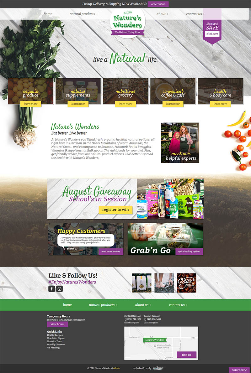
This small town favorite offers natural and organic foods, supplements, home and health products, and much more. Their fresh produce is amazing, and their customer service is outstanding.
They needed a website that was as welcoming as their staff, and that represented their natural brand. Carefully designed to let customers explore what this unique store has to offer while encouraging them to visit the physical locations, this website succeeds with the help of professional photography and a warm, rustic charm.
Now they get many compliments on their website, and calls and emails, as well.
Start Your Design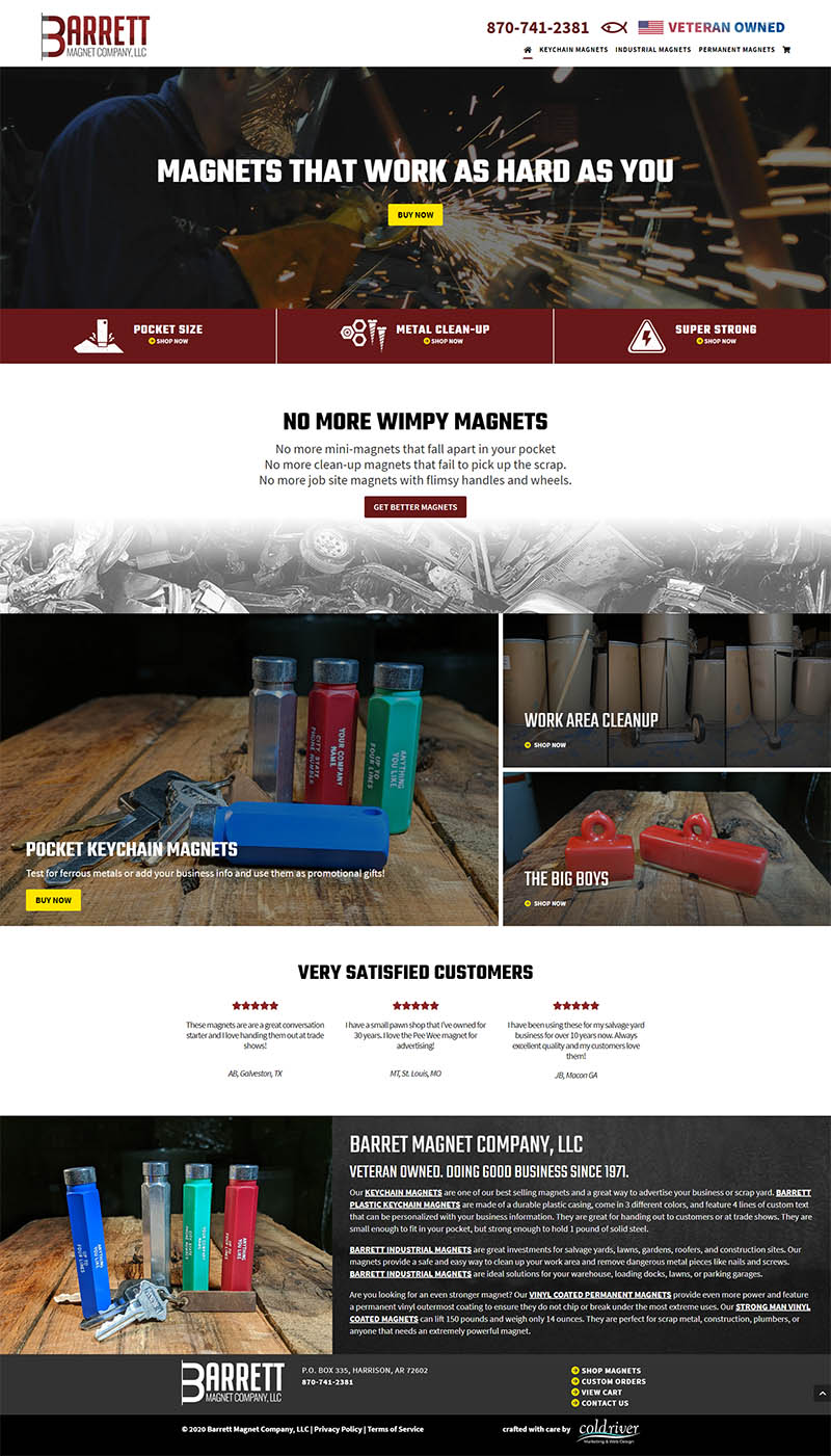
Being able to sell a diverse array of products each with several options and colors was very important to this local, family-owned business. The e-commerce website options were made more complex by quantity discounts, and the option to add custom text.
Our goal was to make the shopping, selection, and customization process in their online store as robust but simple as possible. We also wanted to make sure the site was built to be fast, mobile-friendly, easy to navigate, and search engine optimized. We also created a clean new custom logo to represent their brand.
The owners were extremely happy with the results, and told us about how they like to show off their new website!
Start Your Design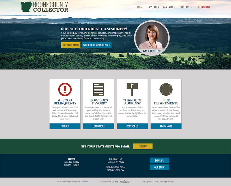
Nobody likes taxes. But, the local country tax collector asked if we could help design her a new website that would be informational, helpful, and encouraging. So we got to work designing a stream-lined website with local Ozarks charm, and a friendly feel. We added in a basic logo design to spruce it up, as well.
The result is a website with lots of available information that also helps local tax payers understand why they pay taxes, and what those taxes fund. Of course they also get access to options to update their addresses, information about how to make payments, and helpful pointers for doing tax research.
We were honored to provide a beautiful, helpful website and logo to our local public servant.
Start Your Design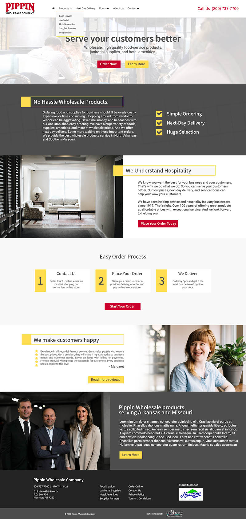
These locally-owned wholesale suppliers pride themselves on their fantastic customer service, easy ordering, and fast delivery. So, they obviously needed a website to represent those wonderful brand attributes.
We wanted to make the face of their online presence clean and inviting, but also professional. Their primary customers are in the food and service industries in North Arkansas and South Missouri, so creating a website design that appeals to experts who are focused on great service is very important.
We are excited to be able to help this family-owned business reach out with a custom small business website.
Start Your Design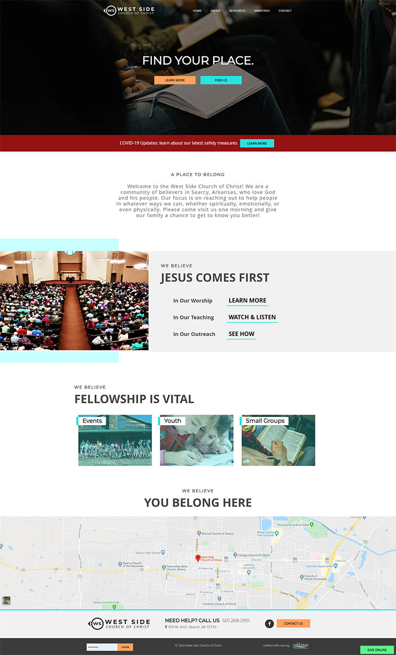
Another church website with a cleaner, more modern feel. This church is in a college town, and wanted a design that appealed more to a younger audience, while also maintaining simple functionality for users who are less tech savvy.
We designed their new, modern logo, and used that as inspiration for the rest of the design. Now they have a website they can be proud for potential visitors to find, that is easy enough for almost anyone to update, and that provides helpful information for their members.
We love helping local churches build a better web presence!
Start Your Design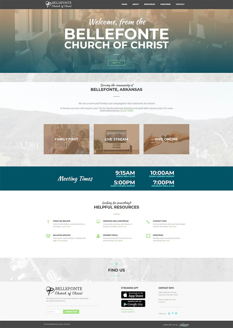
Churches need great websites, too. Often church websites get neglected since many are maintained by volunteers. Or for some the technical knowledge required to keep a church website updated is too high of barrier. That's why we built a customer, church-focused, super simple website platform.
This local church is heavily involved in video production, broadcasting to local TV stations. They wanted a site that showcased that information, but also provided other useful tools for members and guests.
So, we put together a warm, welcoming church website that is easy to use on the front- and back-end.
Start Your Design